How to Choose Abstract Art for Your Space
Most people choose a print and then look for a wall. This reliably produces art that is six inches too small, hung four inches too high, in a colour that fights the sofa. Reverse the order. Measure the wall, decide what the room is for, and let those two facts narrow the catalogue for you.
Start With the Wall, Not the Artwork
Three measurements settle most decisions before taste enters the room.
- The width of what sits beneath. Art hung above furniture should span roughly 60–75% of that furniture's width. An 84-inch sofa wants 50–63 inches of visual width, including the frame.
- The height of the centre. The middle of the artwork belongs 57–60 inches from the floor. This is gallery eye level, and it is almost always lower than instinct suggests.
- The gap. Leave 6–10 inches between the top of the furniture and the bottom of the frame, so the two read as one group rather than two events.
Write those three numbers down before browsing. They convert an open-ended aesthetic question into a short list.
Sizing to the Available Ladder
Prints here come in six sizes measured on the longest side — 12", 16", 20", 24", 28", and 32". Most of the works are square, so those read as 12×12 through 32×32 inches; a few are built to an 8:10 ratio and finish at 26×32 at the largest size. The artwork pages open at 12", but 20" is the safest single choice for an unremarkable wall.
Now apply the 60–75% rule honestly, because it produces a conclusion the studio would rather you hear from us than discover after delivery: a single 32-inch print is not enough for a large sofa wall. With a 2.5-inch mat and a slim frame it finishes around 39 inches, which suits furniture up to roughly 60 inches wide. Beyond that, you have three good options and one bad one.
- A pair. Two 24-inch prints, framed to about 31 inches each and hung 3 inches apart, span roughly 65 inches. This works well with a series, where two pieces are already in conversation.
- A triptych. Three 20-inch prints at 3-inch intervals cover about 87 inches — the right answer for a genuinely long wall.
- A generous mat. A 4–5 inch mat on a 32-inch print pushes the framed object past 42 inches and looks deliberate rather than apologetic.
- The bad option is hanging one 20-inch print in the middle of ten feet of wall and hoping. It will look like a postage stamp, and no framing will rescue it.
Room by Room
Living room
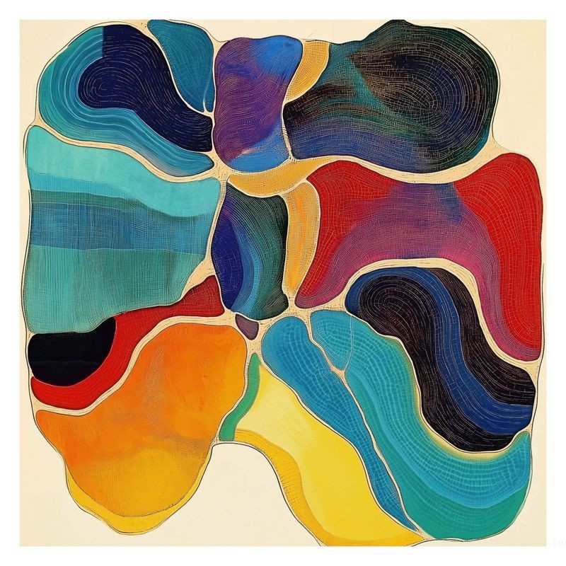
This is the room that can take a single loud statement, because you view it from ten or twelve feet away and the eye has room to travel. Go 28" or 32", or a pair of 24s. Densely worked surfaces suit the distance — the concentric furrows of Gyrification resolve into structure at a distance and into detail up close, which is exactly what a room you sit in for hours requires.
Bedroom
Above a bed, the artwork is the last thing seen at night and the first in the morning, so restraint pays. Keep the palette cool or muted and the scale moderate: 20" or 24" above a queen, a pair of 16s above a double. The Cold Comfort series, which migrates from warm reds through to cool greens and blues, was made for rooms that want colour without volume.
Dining room
Diners sit still and look sideways, so a dining wall can carry a single strong work at 24"–32". Because the viewing distance is short and the duration long, choose something with internal incident rather than one flat gesture — a piece with structure to explore across a two-hour dinner.
Entryway, hallway, and stairs
These are close-range, passing-glance spaces. Small formats win: 12" or 16", hung at true eye level rather than centred on an oversized wall. A vertical run of three 16-inch prints up a stairwell, spaced evenly and aligned to the handrail angle, is one of the most reliable arrangements in domestic hanging.
Home office
A print positioned over your shoulder is the one your colleagues see all day. Sixteen to 24 inches is right; anything larger competes with your face on camera. Geometric work reads cleanly through video compression, where gestural marks turn to mush — the compartmentalised grid of Windows of Perception #1 holds its structure at low bitrates in a way that softer imagery does not.
Getting the Colour Right
The common mistake is matching the artwork to the largest thing in the room. Match it to the sofa and you get a furniture showroom; the eye reads the pair as a set and stops looking at either.
Three rules that work better:
- Pull the third colour, not the first. Find a minor accent already in the room — a book spine, a rug detail, a ceramic — and let the artwork's dominant hue answer that. The link registers without announcing itself.
- Run the temperature backwards. Warm rooms (oak, terracotta, brass) settle under cool-dominant work; cool rooms (grey, concrete, steel) need a warm print to stop feeling clinical.
- Neutral rooms can take one saturated work. One. A white-walled room with a single high-chroma print looks curated; the same room with four looks like a swatch board.
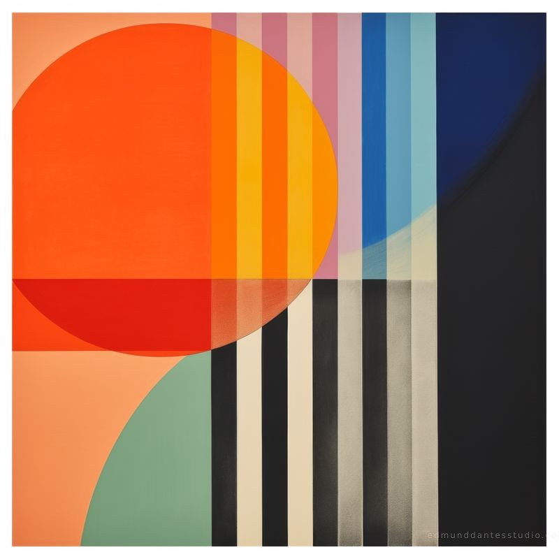
If the walls are already busy — patterned paper, exposed brick, strong joinery — move toward minimalist work with fewer elements and more open ground. If the room is quiet, mid-century modern abstraction gives it something to do. The bold discs and colour bands of Solar Lunar sit at the confident end of that range and will anchor a plain wall on their own.
Framing, Light, and Living With It
Prints ship unframed, in a durable art tube or flat packaging, which leaves the framing decision where it belongs — with you and a local framer who can see the room.
- Mat generously. Two and a half to four inches of white or off-white board. The mat gives the image breathing room and adds usable width to the finished object.
- Keep the frame quiet. A slim natural oak, black, or white profile. Ornate mouldings argue with abstraction and always lose.
- Specify UV-filtering glazing. Independent accelerated-ageing tests rate quality pigment-and-paper combinations well past a century under normal indoor light; direct sun is not normal indoor light.
- Check the light at three times of day. A wall that reads beautifully at noon can be in glare at five. Move the hook, not the print.
Four Mistakes Worth Avoiding
- Hanging too high. The single most common error. Centre at 57–60 inches, always.
- Buying too small. The second most common. When torn between two sizes, take the larger — undersized art reads as an accessory rather than a work.
- Buying for a wall you are about to change. If the room is mid-renovation, take an open edition and defer the decision.
- Choosing by palette alone. You will look at this every day for years. Choose the image you keep returning to, then solve the colour with framing and placement.
Find the piece for your wall
Every work is offered from 12" to 32" as a limited-edition giclée on museum-grade cotton paper, or as an open edition on archival matte. Choose size and edition on any artwork page.
The Method, Briefly
Measure the furniture and take 60–75% of its width. Centre the work at 57–60 inches. Choose the size that fills the space rather than the one that feels safe. Let the colour answer a minor note in the room instead of the loudest one. Frame simply, glaze against UV, and check the light before you drill.
Do that much and the remaining question is the only interesting one: which image you want to keep looking at.

Edmund Dantes Studio
Abstract and geometric limited editions
The studio produces numbered giclée editions of Edmund Dantes' networked, biomorphic, and hard-edge abstractions, printed on museum-grade cotton paper and priced for serious but non-specialist collectors.
First Access to New Editions
Subscribers see new work before it reaches these pages, and get offers kept to the list.